Illustrating a Carton Character in Photoshop
1/8/2025


Introduction
This painting was done in 2011 and I would like to share the illustration process in Adobe Phosotop. I'll show you how to paint a cute cartoon boy portrait.
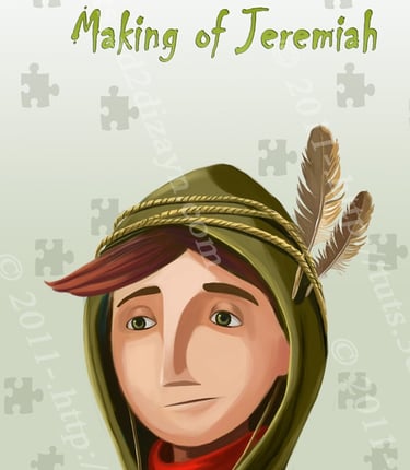
Preview of Final Results
The Sketch
Let's open a new document (about 700x810, 72 dpi). The very first step in this tutorial is to draw the basic sketches for the main idea. After finishing the sketch, I set the sketch layer to "multiply" and started painting.
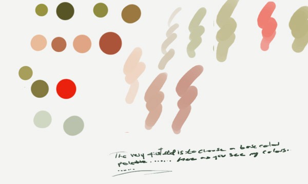
STEP 1
My colour palette. These are my colour choices, but I may change them later, depending on many things like mood and the story you want to tell.


STEP 2
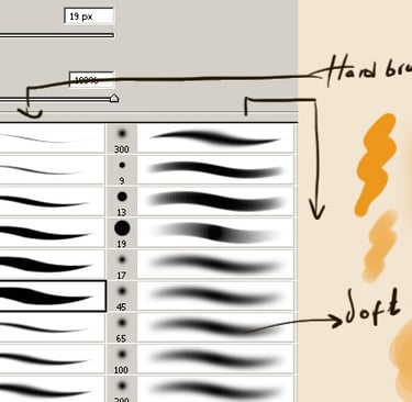
Then I click on the Brush tool (B) and choose a very thin, hard brush. As you know, soft brushes are the blurry ones and hard brushes are more solid. Choose the base of your skin colour and paint with a new layer under the sketch layer. Decide where the shadows will be, making sure that the colour layer is selected, not the sketch layer. Use the large brush to add some general shading to the overall shape of the head and neck.


STEP 3
And now let me show you my layer order. When you start painting there are two very important pieces of information: If your character or object is indoors, the light tends to be warmer, but if it is outdoors, it tends to be cooler, unless it is sunrise or sunset.

STEP 4
Now is the time to determine the look of the background you want. Grab the Gradient tool (G) and fill in the background. Here I will explain how I make the background using the Gradient Tool (G). Here are my colours for the background. One is: # cfd7c2 and the other is: # eaede7.


STEP 5
After choosing a background colour, I start painting the character.


STEP 6
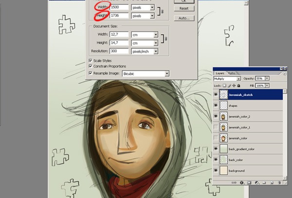
Now that the general details are almost finished. I'm now going to start the very detailed painting. And at this stage I want to change the size of my file, because I'm going to start adding more detail, so I need a bigger file size. So I open Image/Image Size. And set it to 1500x1736 as you can see. Using a smaller brush, I start to add smaller strokes to add detail and blend the colours together, then I use a smaller brush and a darker opacity. I traced around the edges, but also defined some of the pencil shading around the character. It looks pretty good now, but it needs more work.

STEP 7
In this step I want to detail the eyes. Start by colouring the entire eyeball white, or choose my colour with the Eyedropper tool (I). Use a base colour for the iris, it could be green, blue or brown. Use a darker colour for the pupil. And use the same colour but 50% for a shadow. I use the burn tool a few times to darken the top of the eyes. Set the brush settings to 50%, soft round brush. Use the Dodge tool to add some shine along the bottom of the eyes. Finally, add some light green and create a new layer for the shadows.


STEP 8
Now I work on the face, the hood and the feather. I used at least two dark colours for the face. Start with a light one. Remember to start a new layer for the details. Always keep an eye on the lighting. If I want to add more light to the picture, I will use the colour dodge.


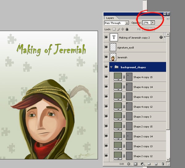
STEP 9
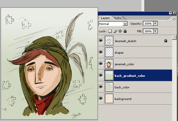
After a few final touches to his face and the hair on his clothes, I created a new layer for the background, on which I'll draw some shapes, using a colour appropriate to the atmosphere. There are lots of nice standard shapes in the Shapes tool box. I pick a suitable one.


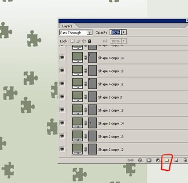
STEP 10
In this step I will show you how to use the Groups function in the Layers palette. As you can see, I have all the different layers shown in the screenshot below: Create a group by clicking on the folder icon in the Layers window, shown below in the red circle. Double click on this group to rename it and give it a name so you know what it contains. My group name is "background_shapes".