Illustration of Wild Deer of Mountains
1/31/2025


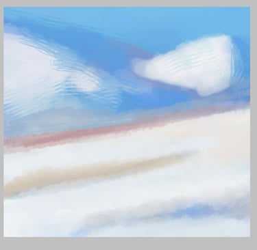
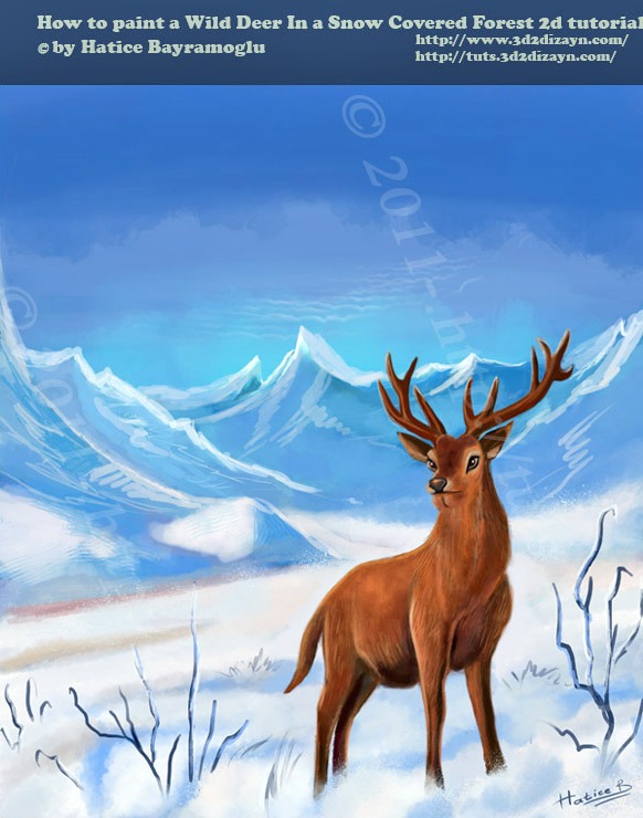
Preview of Final Results
Before I start with the illustration steps, I would like to show you the animation of the Wild Deer illustration. I illustrated this picture on 2014 and last November in 2024 I had the opportunity to see it alive. I hope you enjoy this short animation :D
Introduction
Here I will explain the process of how I illustrated "The Wild Deer of the Mountains". For years I have been working hard to improve my skills in Photoshop. Today I thought I'd share some of the knowledge I've acquired over the years, I hope you find it useful.

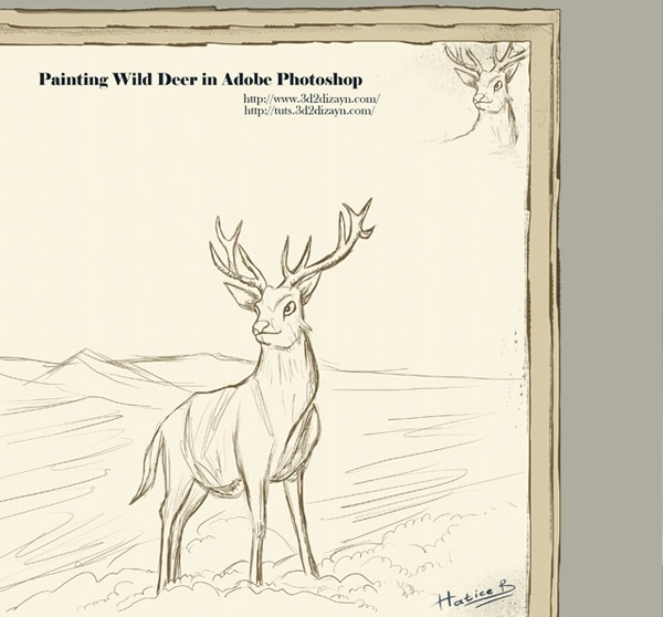
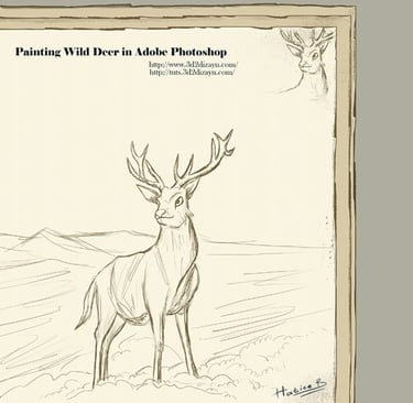
STEP 1 - The Sketch
I start each illustration with a simple tablet sketch in Photoshop. When I make this sketch, I look at a lot of real photos, like photos of snow and wild deer and big snowy mountains. If you like, you can draw by hand and then scan your sketches at about 300 DPI and import them into Adobe PhotoshopCS3.
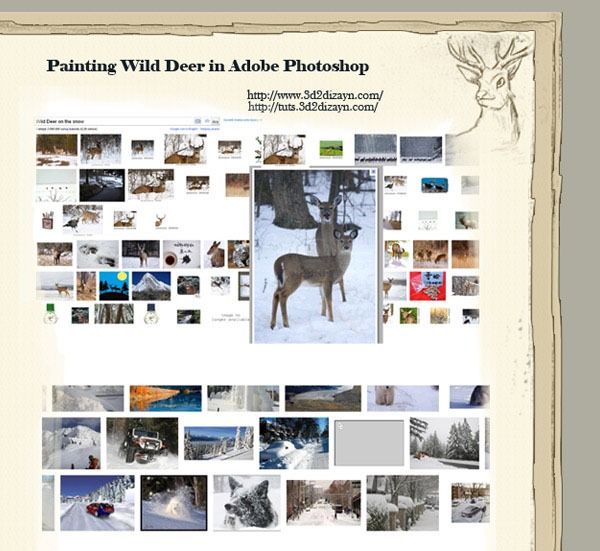
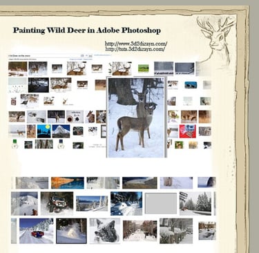
STEP 2 - References
To draw a lifelike animal, it is essential to have lots of reference photographs. This helps you to understand the shape and essence of the animal. All these photos help me to imagine my wild deer in a snowy forest. Whatever you do, make sure your sketch is not on the background. I start drawing the sketch on a new layer.
STEP 3 - Canvas
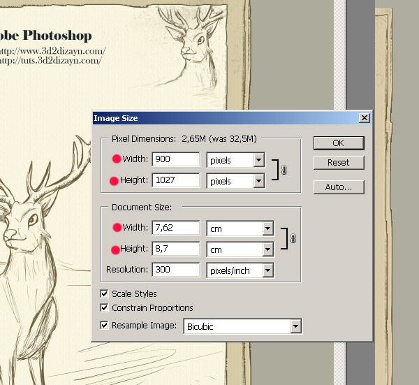
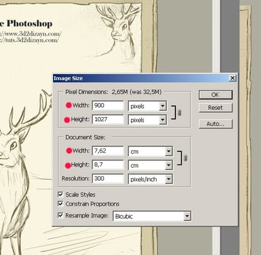
I You can use the Ctrl+N shortcut on Windows (Ctrl+N or File > New) to open a new file. My canvas settings are 900 x 1027px, with 300dp. Name your file and save it.
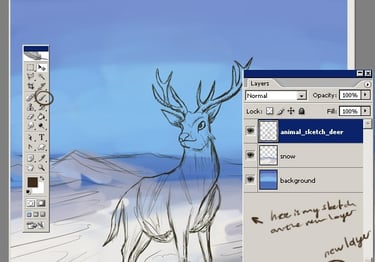
STEP 4 - Layers
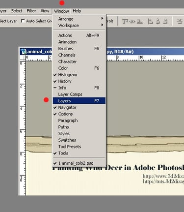
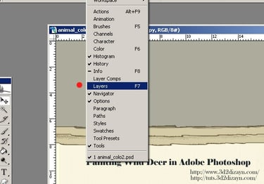
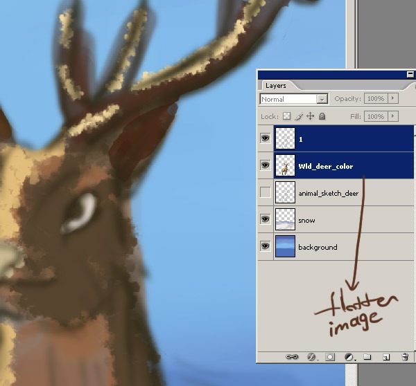
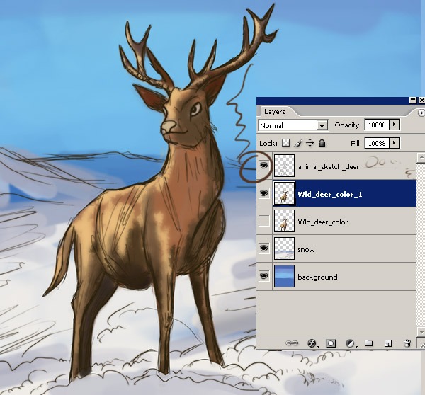
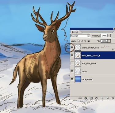
Next we need to create some layers. If the Layers panel is not visible, go to the Windows tab --> Select Layers. I have 3 layers to start with: Background, Snow and Sketch. You can see my layer order screenshot below. Of course I'll add more layers in the next steps.

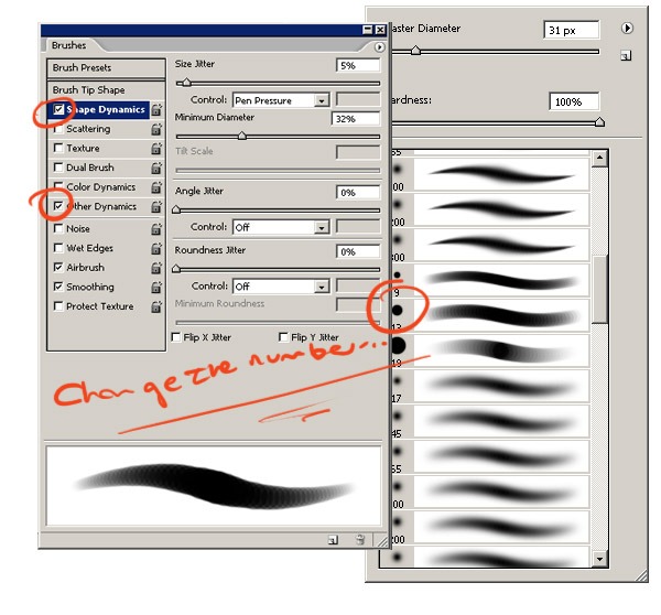
STEP 5 - Brushes
Then I click on the Brush tool (B) and choose a very thin, hard brush. As you know, soft brushes are the blurry ones and hard brushes are more solid. I will just use standard brushes with some different pen pressure settings. Here are my brush settings and these are the brush categories I use most of the time.
The only adjustments I make to these settings are opacity and flow, and in my case I only change the flow, opacity and size jitters to 'pen pressure' because I'm using a Wacom tablet.


STEP 6
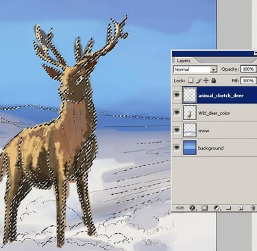
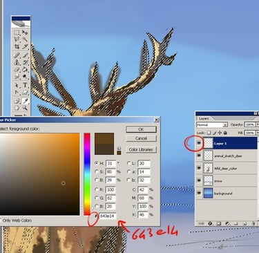
To colour the outline of the character, I select the Sketch layer, create a new layer and fill it with a muted colour from my palette.
To select the Sketch layer, hold down the Ctrl key and click on the Sketch layer icon in the Layers palette. When you select the Sketch layer, it will look like the screenshot below.
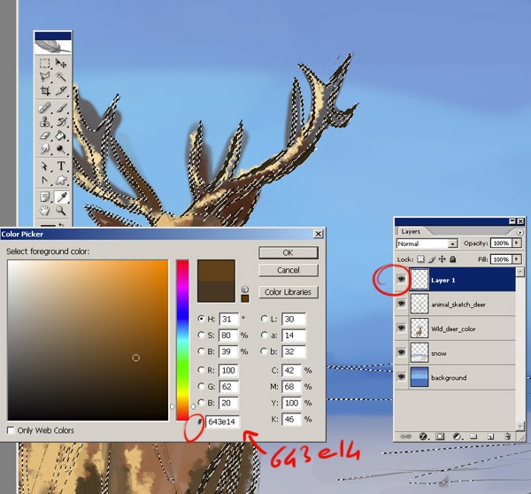
STEP 7
Then press B to get your brush and click on the colour palette to choose the colour (#643e14). This is the new outline colour.
STEP 9
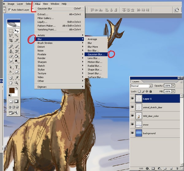
I want to create a soft glow effect, we can easily do this with the Gaussian Blur. The Gaussian blur will blur your selection by an adjustable amount. To apply a blur filter, go to the Filters menu at the top of your workspace. Then select Filter/Blur/Gaussian Blur.

STEP 8
Select the Paint Bucket tool (G) and click on the colour palette to select the colour (#643e14). Fill the new layer with this colour. This is the new outline colour.
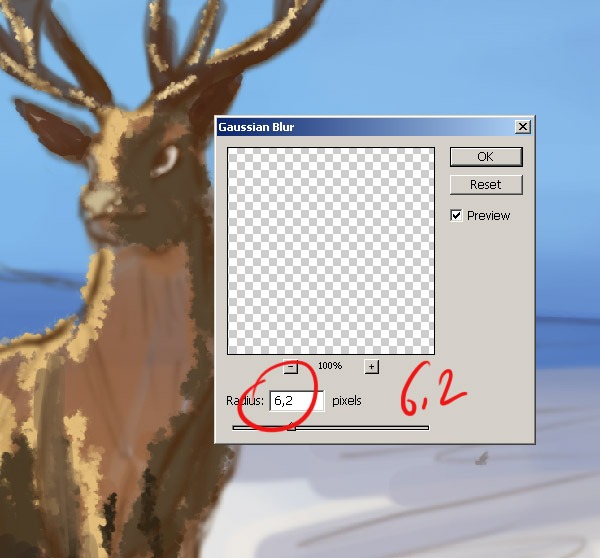
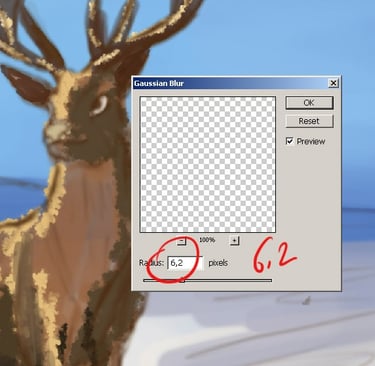
STEP 11
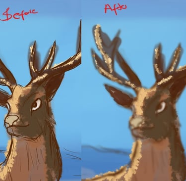
Select Radius 6.2 and click OK. When you're done, apply the blur effect and close the dialogue box. Here's my image sketch after applying the Gaussian Blur filter. See the difference before and after.

STEP 10
A small pop-up window gives you a Radius slider to select the amount of blur you want to apply. Drag the Radius slider at the bottom of the dialogue box to the right to increase the amount of blur applied to the layer, or drag it to the left to decrease the amount of blur.

STEP 13
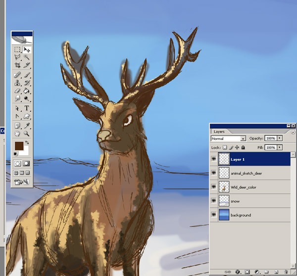
Now it is tme to clean it up! Taking ereaser tool erase all the acces skin that will be touching to the background. Taking a small soft brush and setting is about 40%-30%. I go around with my brush tool that are going to be highly shaded. Start to add a new layers to add shades and shadows. And shadows doesn't have to be always be darker versions of the color used for the base color. it can be other colors too. Start by the darker colors,then, little by little add the light.
STEP 12
Then select Layer > Merge Layers. To merge layers in Photoshop, simply select the layers you want to merge, then press CTRL + E and your layers will merge, or merge down can be found by selecting Layer/Merge Down, or by clicking the arrow in the top right corner of the Layers palette and selecting it:
STEP 15
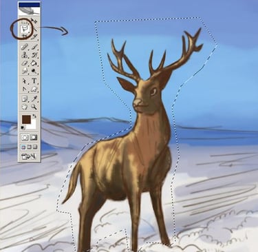
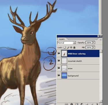
And now... I am going to cut out the deer from the background. Click on CTRL+x or on the top menu Edit/Cut and Paste. Ok, now I have one layer for the deer and a second layer for the background. And the first thing you need to do after creating this layer is to give it a descriptive name. To give the layer a name, double click on the layer label, the label will turn into a text box where you can type in a new name. Ok, as you can see my character layer is called "Wild Deer Colouring" and the other layer is called "Mountain Sketch".

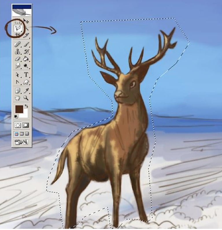
STEP 14
Ok, now I am going to separate the deer from the background sketch. As you know, I draw the background and the wild deer on the same layer... so now I need to create two layers. One for the figure and the other for the background. Select the Polygonal Lasso tool and make a selection of the character.
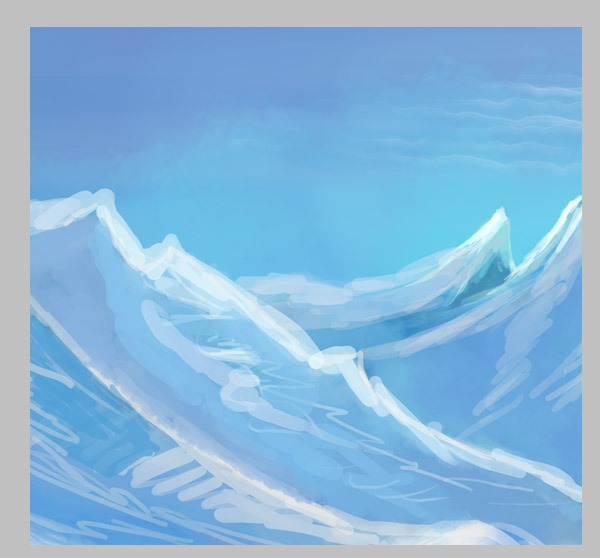
STEP 17
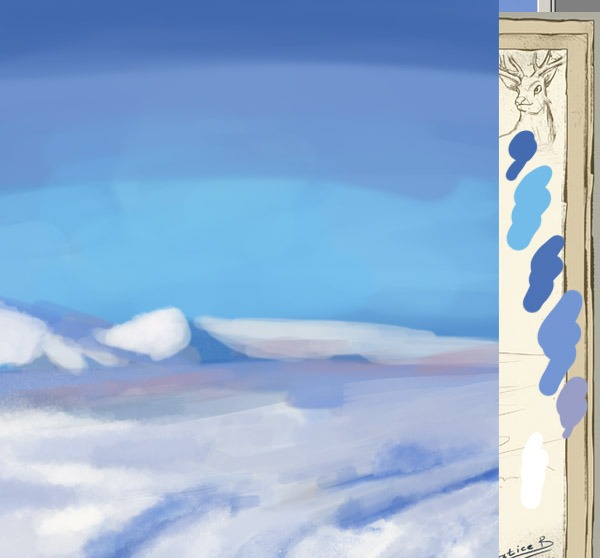
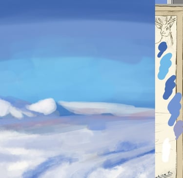
Don't worry too much about details at this stage, they'll come later... just try to block out the shapes, decide where there will be shadows and where there will be light. Now you can start to add some contrast and value to the cliffs. I used a lighter blue for the highlights and a darker blue for the shadows.
STEP 16
Before I painted this snowy area, I collected some references to a typical snowy landscape: trees, preferably snow-covered. With a small brush I painted some distant mountains. I kept them simple, if you want to add some detail, just add some light blue, almost white, to the tops of the mountains, for the snow.
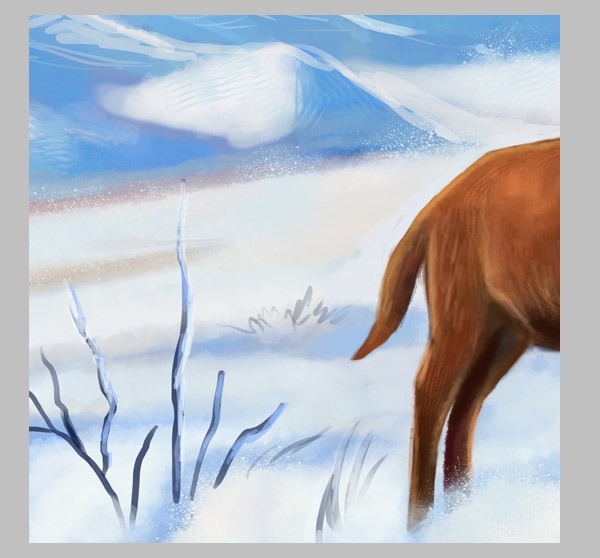
STEP 19
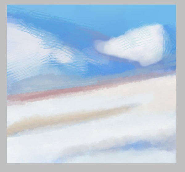
For the small dry branches on the ground, I used all the hard round brushes set to between 10% and 50% opacity. I prefer the hard brushes. Here you can see the little snowy dry branches, first I chose a dark blue colour and then I created a new layer for the snow on the little trees and roughly painted it.

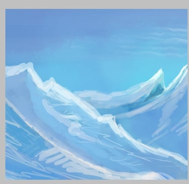
STEP 18
With a small brush I painted some distant mountains. Now you can start to add some contrast and value to the cliffs. I used a lighter blue for the highlights and a darker blue for the shadows.

Conclusion
Here is the final result of the illustration. I will also leave the link to the short animation video here. And if you ask me: "Are you available for freelance offers, children's book projects or portraits? I say yes, I am! Feel free to contact me if you really like my style and artwork.
Thanks for reading!
See you in my other tutorials!