Katya: Children's Book Cute Character Illustration
1/31/2025
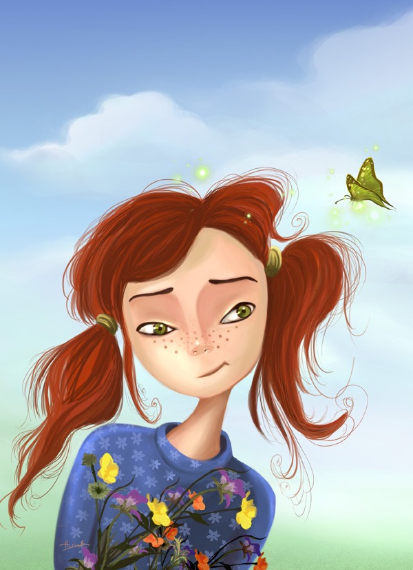
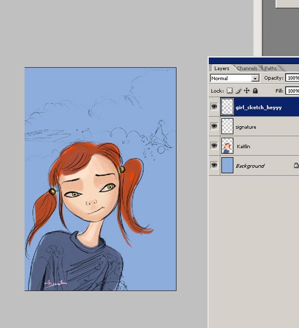
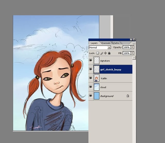
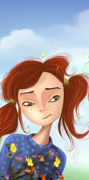
Preview of Final Results
Introduction
The concept of this illustration is about a little cartoon girl who is surprised by a green butterfly. In 2010 while walking in the park, I saw a very cute little girl looking at a butterfly and smiling at it. She looked so cute and innocent with this colourful butterfly and a handful of flowers on her little hands. So I decided to make a painting about her and her little friend. When I got home I started this illustration
In this tutorial I will use Adobe Photoshop and a Wacom tablet to create the finished 2D painting. This tutorial will show you how to colour, shade and create a a cute children's book character.
Before I start, I would like to say that I illustrated this character during 2010 and have always wanted to animate all my digital paintings and see them come to life. Recently I the opportunity to see this illustration animated, and I was very happy with the result.
Here is the youtube link for you, I hope you like it too :)

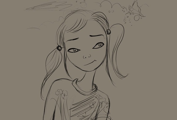
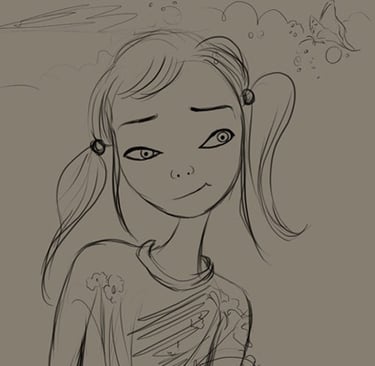
STEP 1 - Rough Sketch
I always start with a rough sketch for my concept work. The background and the sketch both have their own layers.
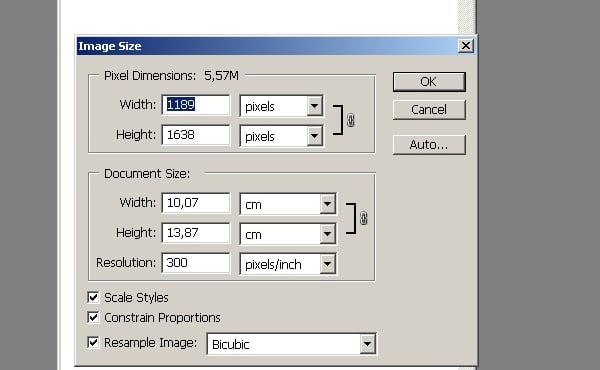
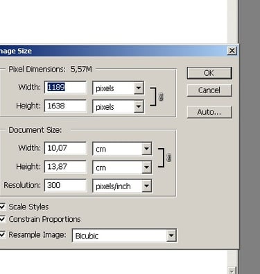
STEP 2 - Setting Up The Canvas
I started with a canvas of about 1000x1378 pixels so I could work on the details. Create a wide, high DPI canvas like this:
STEP 3
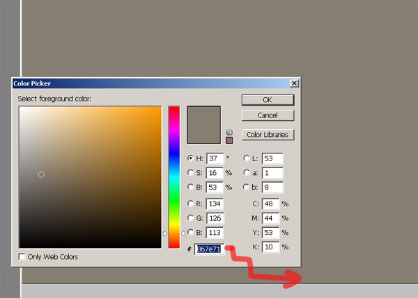
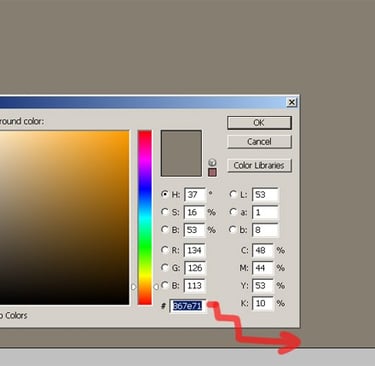
Now I'm going to fill my document with something other than white. White is too bright and not good to start with, #867e71 is good for now.
STEP 4
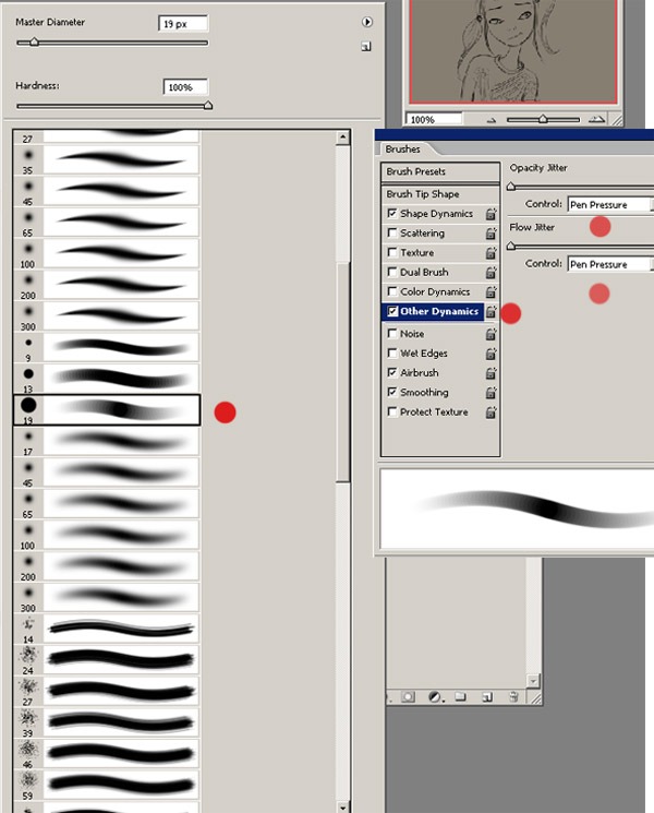
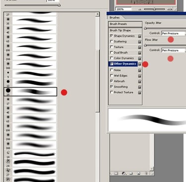
Here are the brush settings I'm using to create my character. I use a standard airbrush pen opacity flow. And we can set it's opacity to pen pressure if we want. Start by selecting the Brush tool (B) and then use a standard brush like the one shown below.
STEP 5
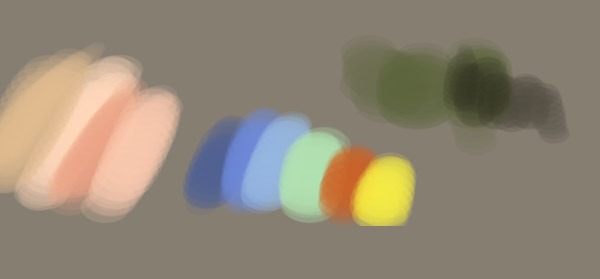
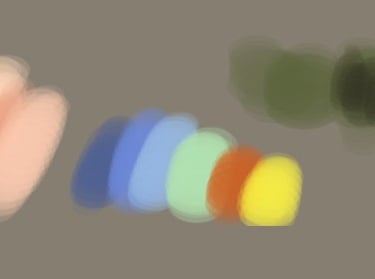
After arranging the size of the canvas, I set up the basic colours that I thought I might use for the sketch before I started the composition, choosing the colours (background and character). And here are the colours I used for this artwork. Later on I may want to enrich my palette and add more colours. My choice of colours depends on the picture and the subject. Here I choose a bright blue for the sky. And other colours are for the character colour. The next step will be to colour the character.
STEP 6
Now I started to try out some colours for the background. I created a layer behind the sketch layer and roughly filled it with the basic colours I had chosen. I created 4 layers here. This is the way I always work when creating an illustration. For the character, I started by painting the general lines and giving them dimensions. The light is cloudy and a little daylight, so there wouldn't be a clear shining light, but some vivid colours. Then I start working on the face and hair. At this stage I can start to roughen up the values.
STEP 7
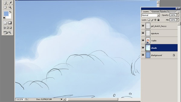
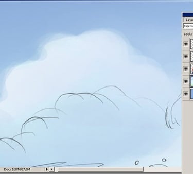
I started by painting the background. In this step I knew I wanted my background to look cloudy, with some big white clouds, so in this step I added some rough clouds to the sky. Using my airbrush pen, I painted the white cloud on a separate layer. Then I merged it with the background layer.
STEP 8
As you can see from my sketch work, these initial sketches are sometimes not good enough, but you know you can fix things later. Here is a close screenshot of the basic colouring: after choosing the face colour, I started to block in the face. I always do the shadows first and leave the light tones and hot whites for last.
STEP 9
I also add all the details of the character, the face and hairstyle of the character, which is the most colourful element of the composition. I continue to add more details. At this point I realised that the background colour was not so good, so I thought it was time to find a better colour for the sky. And maybe I can add some clouds. Look at the colour of her eyes and her light area. I used the colour dodge tool for the shiny areas.
STEP 10
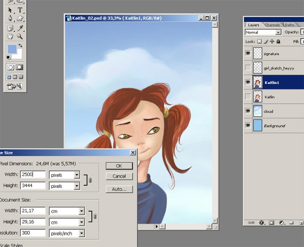
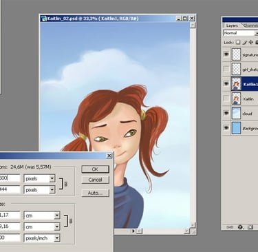
Now I want my file to be bigger, because at this stage I don't think I'll be able to do as much detail. So I open Image/Image Size and set the number to 2500x3444. And now we can easily start adding details to her hair.
STEP 11
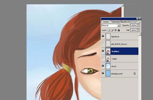
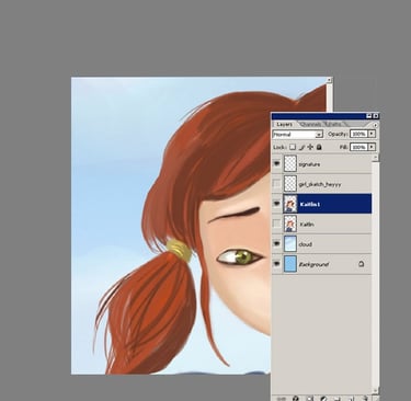
Now look at the hair. This is very important. Don't use black for the shadows in the hair. Black is the colour that looks good in the comic book drawings, but not so good in paintings like this. Use a darker red for the shadows.
STEP 12
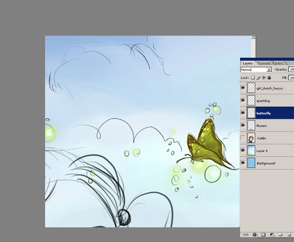
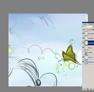
I created a new layer and started to paint the butterfly as you can see. The butterfly layer is on top of the character colour layer. I continue to add more detail to the butterfly. And as you can see, there is also a new layer called flowers. I'm now going to work on the wing to add more detail.
STEP 13
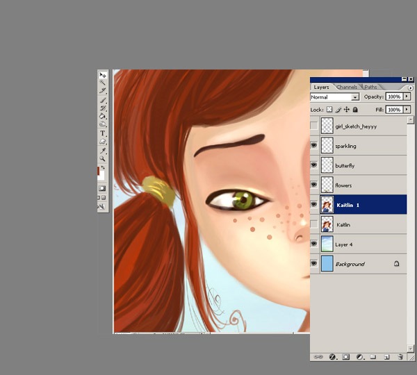
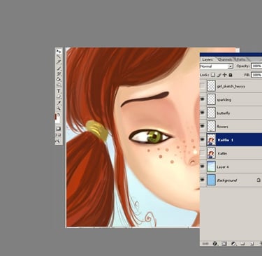
Then I work on the details like the nose, the hair and some freckles, maybe I will add some little details for the hair ribbons too.
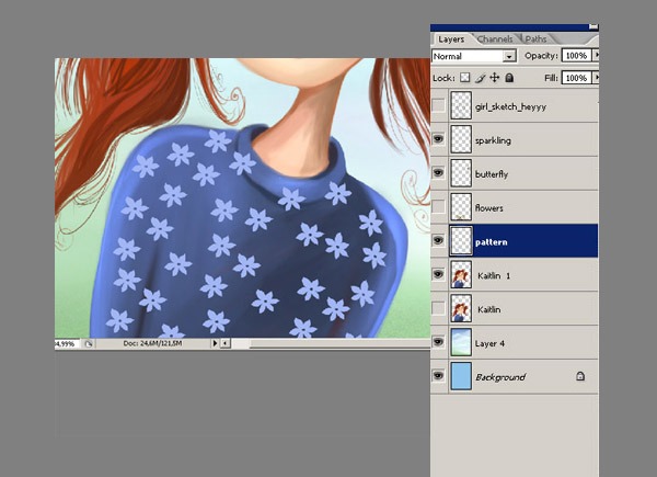
STEP 15
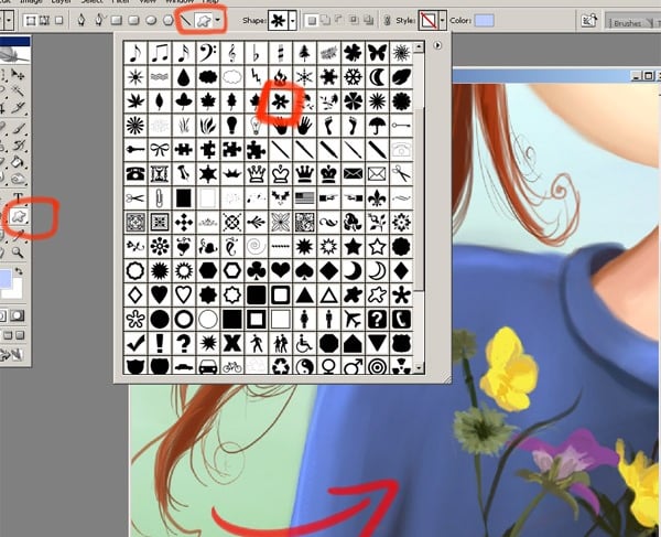
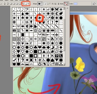
Now select the Custom Shape tool (U) and make your choice for the shirt pattern.
STEP 14
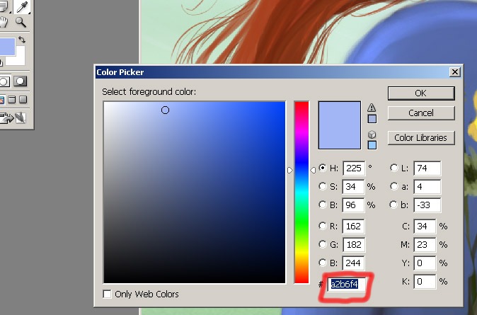
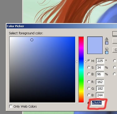
And I also need to add some pattern to her shirt. Here is my colour for the pattern. I think #a2b6f4 will look good here.
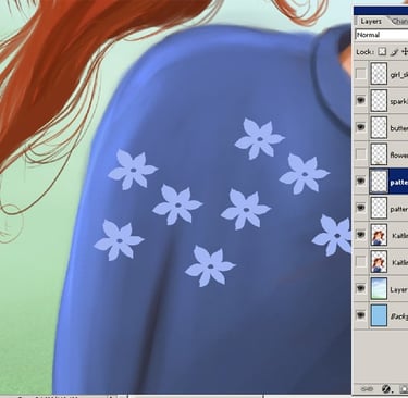
STEP 16
To create a random pattern I make a copy of the shapes. And then merge all the patterns.
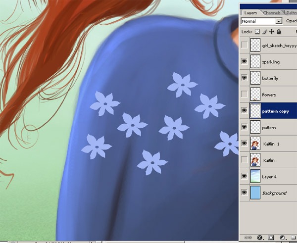
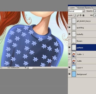
STEP 17
I dublicate the pattern again and then merge all the pattern layers. And reduced the opacity.

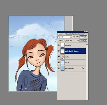
Conclusion
Learning digital illustration in PS or any other application is all about practice, without experiencing how things work it is hard get the instinctive knowledge that comes from trying. So...open Photoshop and have fun! =)
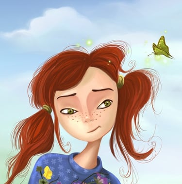
And here's the final illustration, I hope you enjoyed this tutorial. Thanks for reading and please check out the animation of this digitila illustration:)