Making of Cute Cartoon Orange
1/30/2025

STEP 1
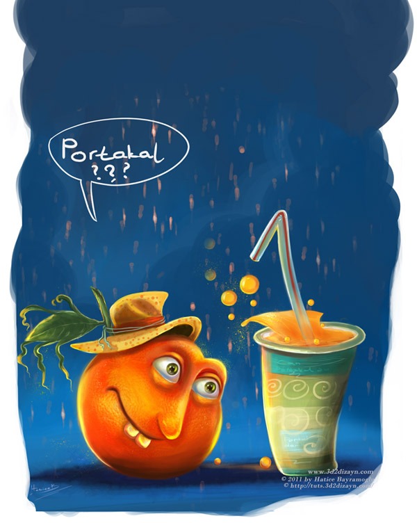
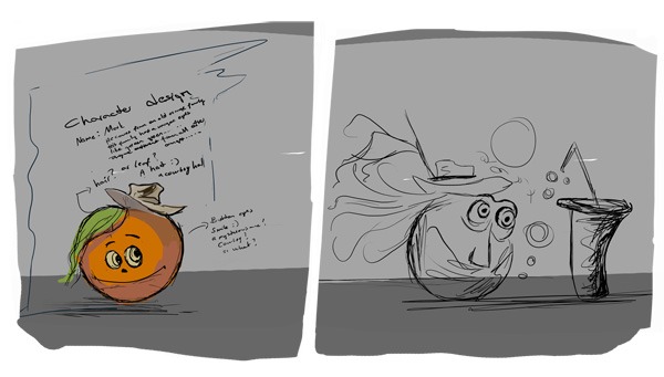
The very first step is to make some basic sketches of the main idea. I started with some quick sketches of the character. First I did some sketches in Photoshop using a small pressure sensitive brush. I start with thumbnail sketches to get inspiration. I did quick pencil gesture drawings to explore different poses and proportions. What is the story about? Think about the story before you start sketching. It can save a lot of time. My orange character has a name of course, and his name is Mark. He is a cute orange Toon character and he is looking at this orange juice glass in wonder. Trying to find out what happened to his friend :D Get the idea of this sketchwork? See, this is what I am trying to explain to you when I draw him. It is always very important to have a backstory for all your characters.


STEP 2
Let's start by opening a new document with a size of about 800 pixels by 532 pixels and a resolution of 72px/inch. On the first Photoshop file, select your sketch layer and drag it onto this new file (800x532). Your layer should now look like this and you should rename it to "Mark Sketch" and save your work as "Coloring Orange".


STEP 3
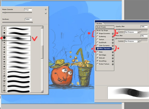
I start with a standard hard edge brush. The only adjustments I make to these settings are the opacity and the flow, and in my case I change the flow, opacity and size jitters to 'pen pressure'. Because I'm using a Wacom tablet.
STEP 5
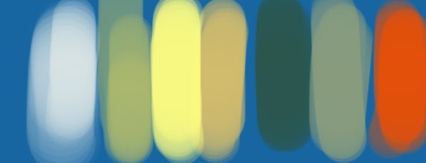
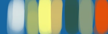
An important stage in creating your artwork is deciding which colours will work best for your painting. Here are my colour choices. I want to make something really colourful and warm for the cartoon orange painting. I have chosen a dark blue for the background. Other colours are for the character's face and the paper jar.
STEP 4
As you can see from these steps, the colouring and atmosphere is quite simple, I spent some time on the colours, things like the main colours and the background colour. I add a new layer in Photoshop under the drawing and start to colour the background layer.

STEP 7
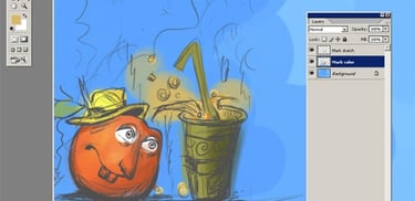
Try not to lift the pen too much. Too many strokes will destroy the smooth gradient effect we are trying to achieve. I'm adding a few more colours. Here's a look at the character's painting, his eyes are starting to look clear at this stage. In the next steps I'll work more on the eyes and the body and try to bring the character to life.
STEP 6
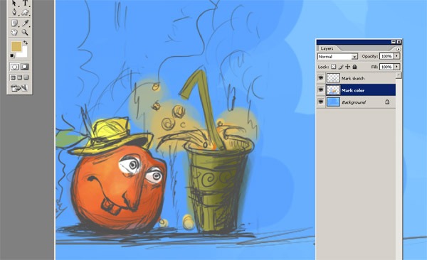
Now that we have chosen our colours, we can start to colour the orange. Don't worry about going outside the lines. We will clean that up later. Now select one of the brushes and turn the opacity really low and use a large brush. Make sure that the "mark colour" layer is selected and not the sketch layer :) Use the large brush to do some general shading for the overall shape of the orange and the paper jar. As you can see, there are no details yet.


STEP 9
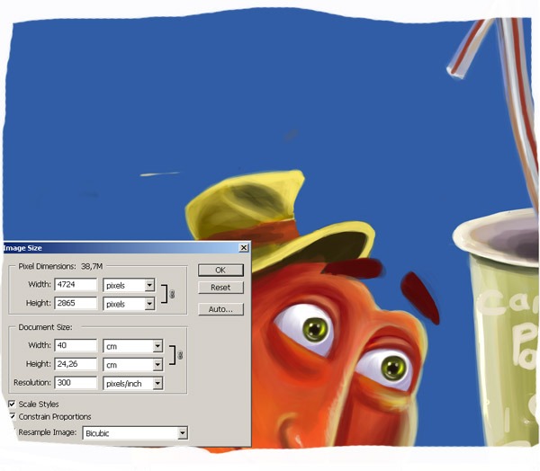
Now we need some tones. Use at least two darker tones. Start with a lighter one. Use a small sharp brush with up to 30% opacity. Smudge the hat as shown. Take some dark paint, set the opacity to 60% and draw some thin lines. And at this stage I'd like to change the size of my file, because I'm going to start adding more detail, so I'll need a bigger file size. So I open Image/Image Size. And change the settings to 4724×2865 as you can see.
STEP 8
I used a smaller brush and a darker opacity. I traced around the edges, but also defined some of the pencil shading under the glass and around the orange. It looks pretty good now, but it needs more work. I will continue to add detail and open new layers as needed.


STEP 11
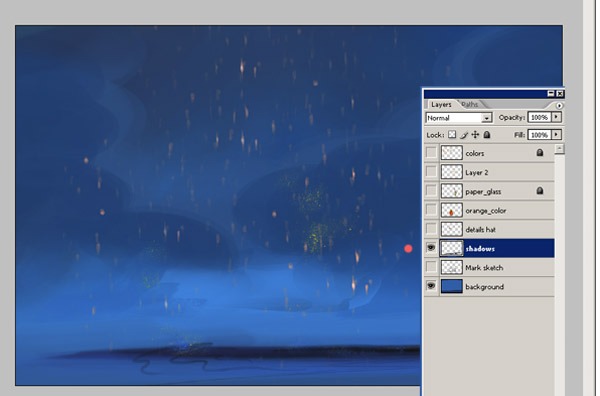
Here I decided that the background was too light to create the mood I wanted, so I duplicated the coloured background layer and set the layer mode to Overlay. I don't like working on plain looking backgrounds, so I added some detail.
STEP 10
I'm adding a few more colours. Here's a look at the character's painting, his eyes are starting to look clear at this stage. Now we can start detailing our character's hat. I also used Colour Dodge on the light areas and continue to add more detail. I'd also like to add some detail to his hat, like a leaf. Three things are done here; I added darker shadows, I added warm colours to the right side of his face and then I added blue to the shadows. The blue comes from the atmosphere. And finally, again from the atmosphere, I added some blue light from the explosion. .and more shadows and highlights. I want to change the shape of the orange leaf. I don't like the shape of the orange leaf.


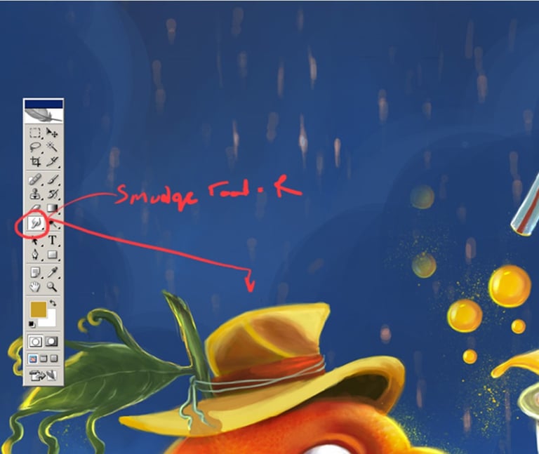
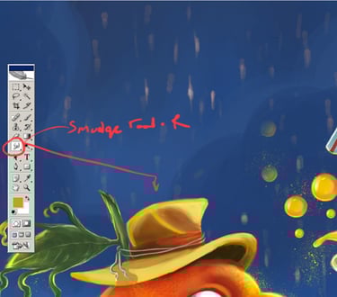
STEP 13
And here, as you can see, I used Smudge Too (R) to smooth. The Smudge tool is used to smear paint onto your canvas. The effect is similar to finger painting. You can use the smudge tool by clicking on the smudge icon, clicking on the canvas and dragging in the direction you want to smudge. As you can see in the orange below, you will mainly be using the brush and smudge tools, and maybe the occasional dodge or burn tool for extra highlights and shadows. Eh, you might think this is a very long process :) but I say be patient and your efforts will be worth it!
STEP 12
As you can see in this step, I have added detail to the hat and changed the shape of the leaf. Use your creativity and decide what kind of detail you want to add to your character.


STEP 15
I used a light orange colour by mixing a few more yellows. First I click on the Brush tool (B) and choose a very thin, hard brush I take the Brush again and pen pressure on other dynamics. I start on the left, where there is no light, and move to the right, where the orange is exposed to the light source in a light scene. This gives the desired colour range for each part of the picture, but no strong darks yet. After I've applied my light colours with the Dodge tool, I go back and start to take darker colours by taking dark orange colour. To make it shiny or something, I use the thin brush and add highlights on the sides as in the picture.
STEP 14
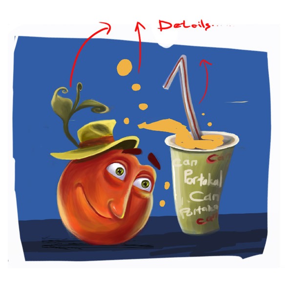
Here I changed the background colour a bit and added some details. There is a shadow layer and the opacity is reduced to 60%. You can change the settings as you like. And I always use standard brushes for the details. Now I continue with the details and the other parts like the dust flying in the air. Looks good so far I think... but let's continue... .... now the final steps. Adding as much detail as I can.


Conclusion
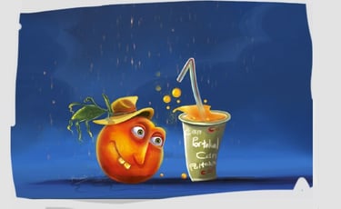
Anyway, this is the end of the tutorial. I hope these basic steps have helped you get a better understanding of my process and how you can apply it to your own technique and illustrations. Keep practising, be creative and enjoy my tutorials. If you have any questions, please let me know and I will do my best to answer them. Thanks for reading.