Still Life Painting in Photoshop
1/31/2025
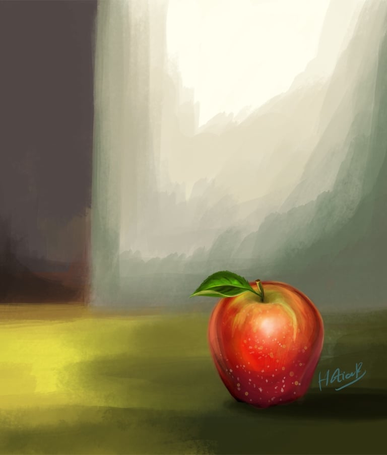
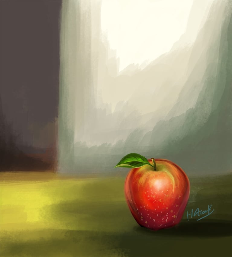
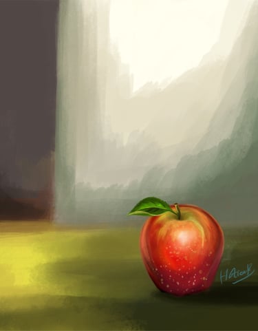
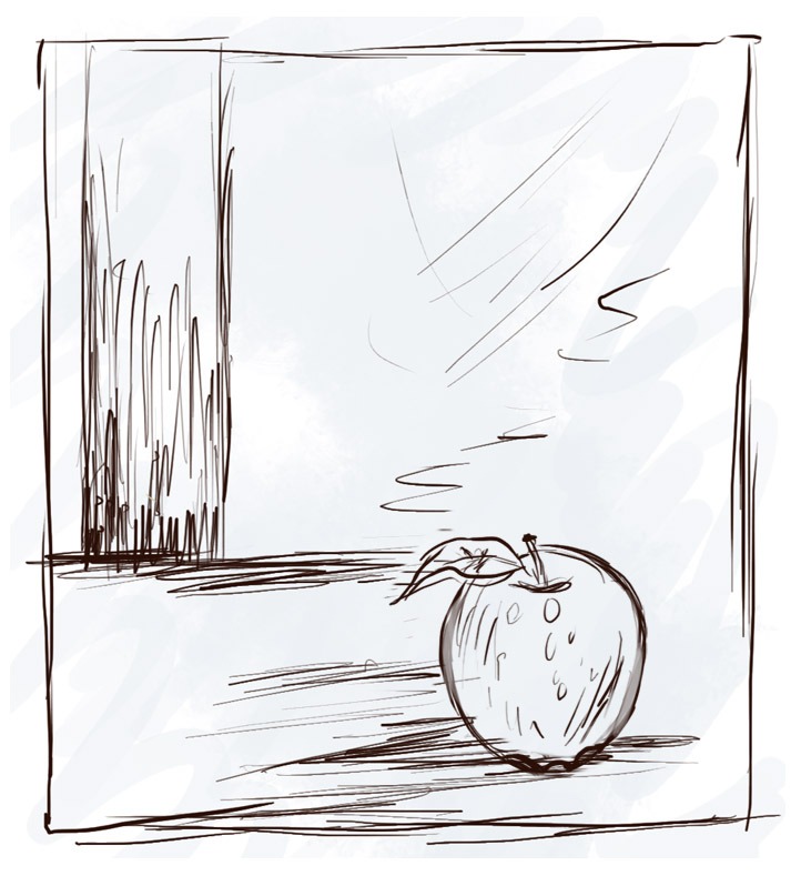
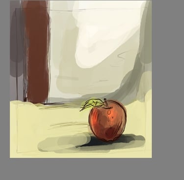
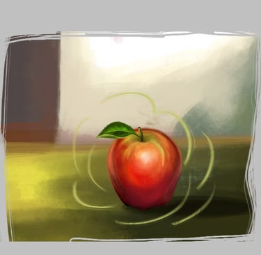
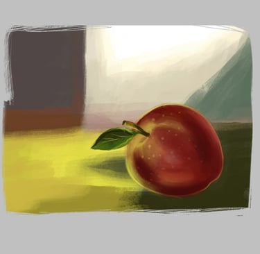
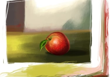
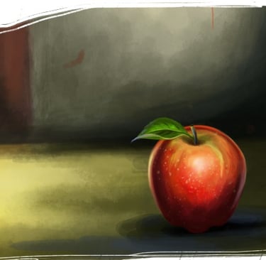
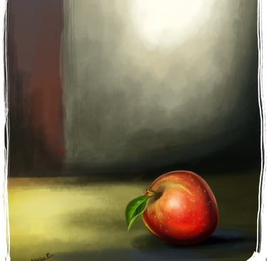
Preview of Final Results
Introduction
In this tutorial I will guide you through the process of illustrating a still life. Painting a still life is a great way to practise shading and mixing colours. You can have a photo of an apple for reference if you like, working from a photo is fine, you will get good shading and reflections of real life. Although I'll be colouring with an apple fruit sketch, you can apply the skills from this tutorial to any digital still life colouring project.
STEP 1
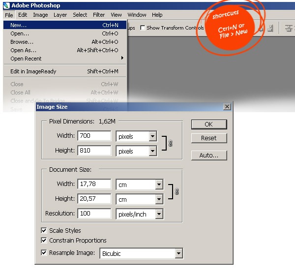
This tutorial assumes that you have some basic knowledge of Adobe Photoshop, so let's start by opening a new document (about 700 wide by 810 high, about 100 dpi resolution) and making a preliminary sketch.
STEP 2
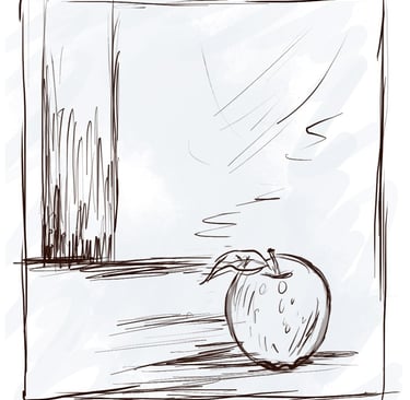
The very first step in this tutorial is to draw the basic sketches for the main idea. Sketching is an essential part of any creative process. I have made some sketches. You can download the image below and use it for your sketches.

STEP 3
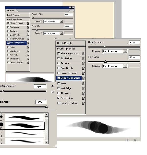
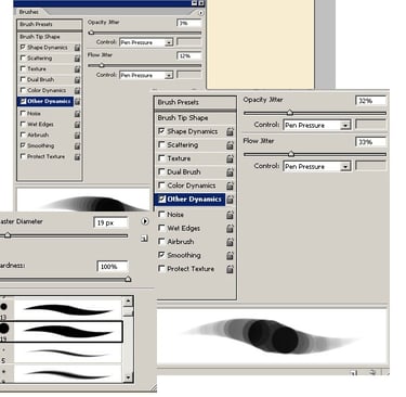
Adobe Photoshop is a wonderful program with a great brush engine. For this tutorial, I will be using one brush in particular, and the following are the steps to create it. I click on the Brush tool (B) and select a very thin, hard brush.
STEP 4
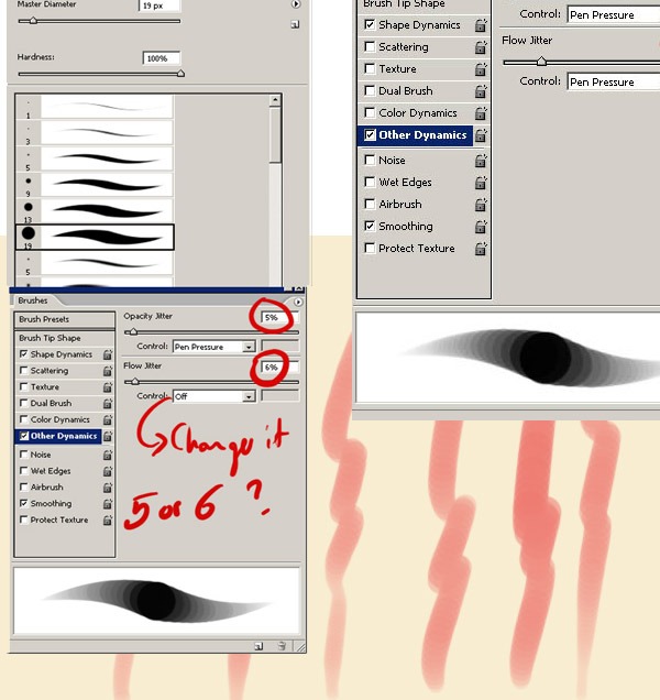
Open the Brush palette (F5). Opacity Jitter should be set to Pressure, only effective if you have a pressure sensitive tablet. Brush tip shape - Set your spacing low, I use 7% here. Flow - On the brush toolbar, set your flow to a low setting, like I did
STEP 6
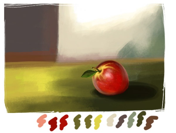
Once the sketch is done, let's choose our colour palette. Here are my colour choices. The very first step is to choose the right colours for our still life.
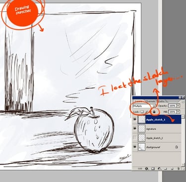
STEP 5
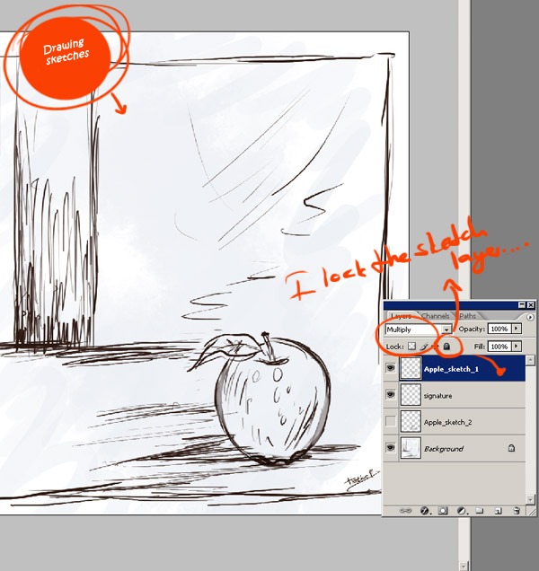
After finishing the the sketch, I set the sketch layer to "multiply". I lock my sketch layer.


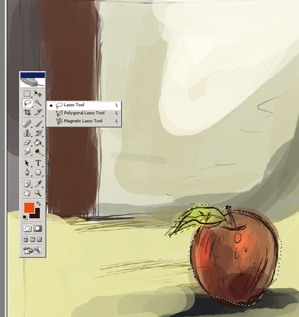
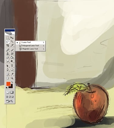
STEP 8
Use the big brush to do some general shading for the whole shape, or we can colour the layer using one of the selection tools. Select the Polygonal Lasso tool from the toolbox. Use this tool to make a selection of the apple, as I have done. Then fill it with the Paint Bucket tool.
STEP 7
Now make sure you have defined your light source to have realistic shading. Set the Sketch layer to Multiply mode, create a new layer and name it Apple colouring. This new layer will be our blocking colour layer. Choose a large brush and start painting, decide where the shadows/water will be.
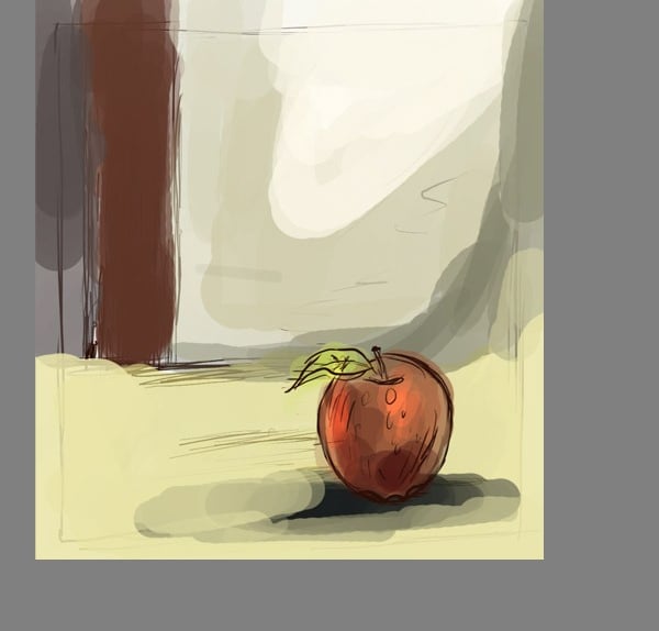
STEP 10
At this stage we are ready to add the lighter values. Take the original colour of the fruit and make some soft touches with your brush, if you wanted to start with a different colour you can add another layer and do more shading. Using a smaller brush, start to apply the highlights, blending them into the main and shadow colours.
STEP 9
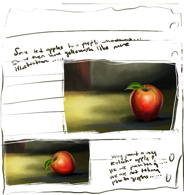
Don't assume that all red apples are completely red. They usually aren't. Some red apples have purple shadows on them. Some have green shadows. Some even have yellowish shadows. And remember, digital paintings are not as realistic as photographs. I say, if someone wants a photorealistic painting, let them use a camera. Why paint a very, very realistic apple? We paint, we do not take photographs. I really don't want my illustrations to look like real photographs. My aim in art is not true visual realism, my aim is to get closer to what the eye and imagination sees, rather than what the camera sees. Ok, if you agree, let's continue with our still life painting.
STEP 11
This is where I decide where the darkest areas are on the fruit and paint them in with a clean brush. The darkest areas will be near the base and on the side away from the light source. If your shadows are darker than the fruit itself, don't worry, it will probably make the painting more dramatic.
STEP 12
Now is the time to clean it up! Using the eraser tool, erase all the access skin that touches the background. Take a small soft brush and set it to about 40% -30%. I go around with my brush tool that will be heavily shaded. Start adding a new layer to add shadows and shadows. And shadows don't always have to be darker versions of the colour used for the base colour, they can be other colours too. Here I am trying different colours for the apple.
STEP 13
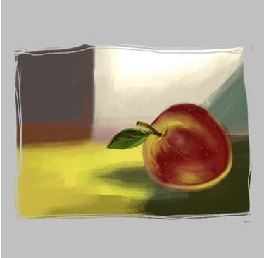
Now that the general details are almost in place. I'm going to start a very detailed painting process, using smaller brushes and adding some even brighter highlights to the areas that glisten with reflected light. You will be amazed at how a few small details bring the piece to life. For example, these little dark edges on the stalks of the apples. Using a smaller brush, I started with smaller strokes to add detail and blend the colours together. Then I used a smaller brush and a darker opacity. I traced around the edges, but also defined some of the pencil shading around the character. It looks pretty good now, but it needs more work.
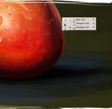
STEP 14
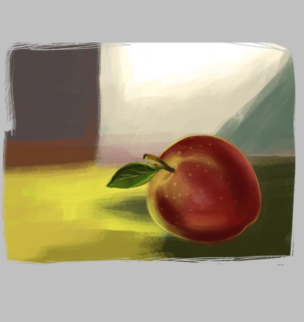
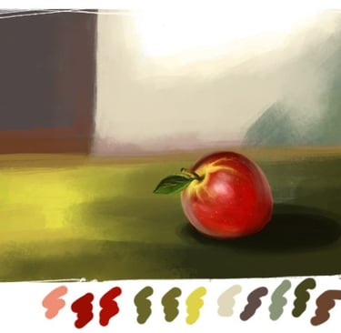
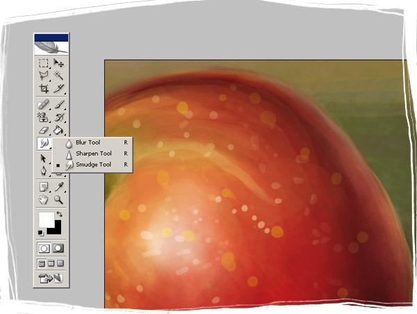
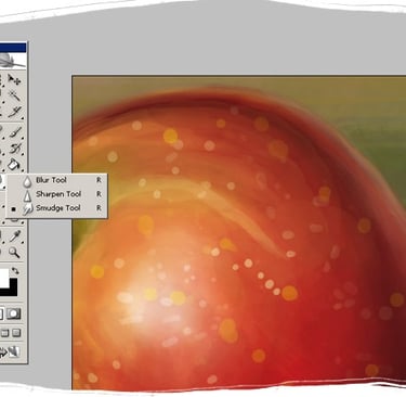
Add the highlight colours, thinking about how the light would fall on the object, in this case an apple. Now you can blend the colours. There are several ways to do this. You can use the smudge tool, or you can use the Guassian blur filter, or you can use the brush. I used the brush to blend, but if you like you can use the smudge tool.
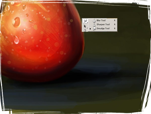
STEP 15
I also want to add a few drops of water. I used the smudge tool for the water drops. Stroke it in a few directions as you can see. Now I don't think the water drops need to be very detailed. Finish adding the light colour you want and then create a new layer for the details. Take your time with the details.
STEP 16
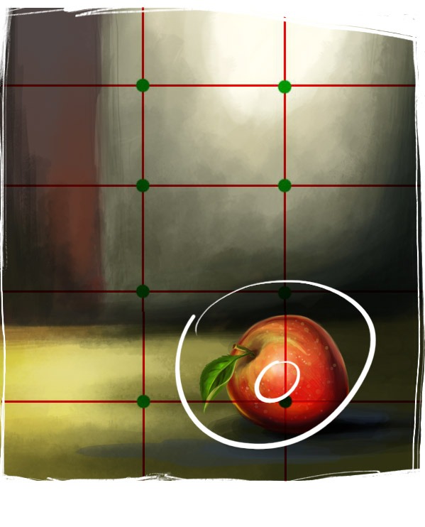
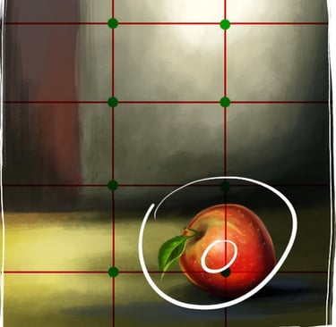
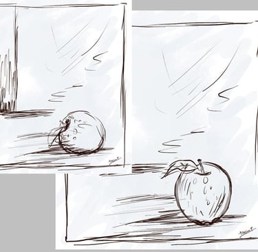
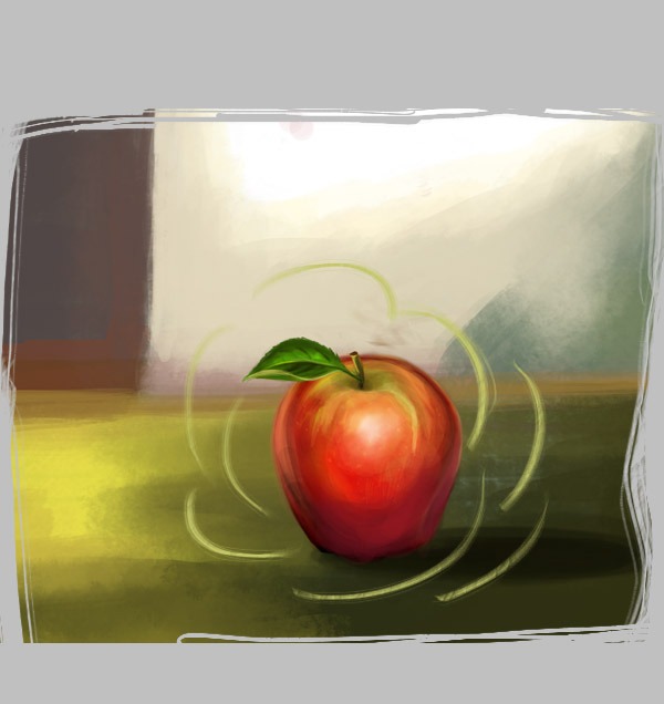
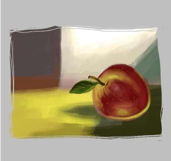
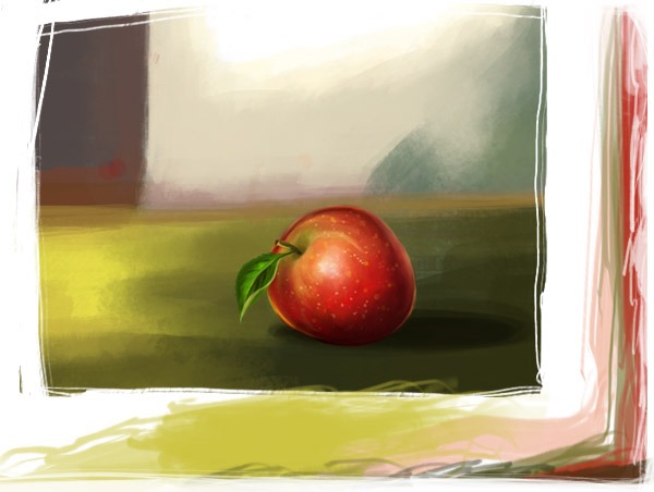
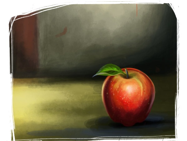
At this step , I like the result, but I think the apple is not in the center of the viewer's focus. Let me tell you about the rule of thirds. The rule of thirds is a compositional guideline that suggests dividing an image into a 3x3 grid and placing key elements along the lines or at their intersections. This technique creates balance and visual interest. It wasn’t specifically created by Renaissance painters, but the idea of dynamic composition has been explored in art for centuries. The rule of thirds helps guide the viewer’s eye naturally through the image rather than focusing solely on the center."
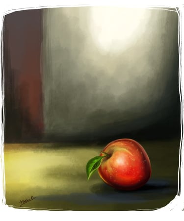
STEP 17
To make this easier to understand, let me draw three lines—one horizontal and one vertical. As you can see, the rule of thirds is based on dividing your illustration into 9 equal parts using imaginary lines to create 3 equal sections both horizontally and vertically. My diagram below explains this better than words. Now, I have eight key reference points: four lines and four intersections. The idea is to position your main subject along one of these lines or at an intersection. This approach makes compositions feel more dynamic and visually engaging rather than looking like a simple snapshot. Research suggests that using this technique helps the brain process images more easily, making them more visually appealing.
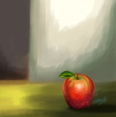
In this image, the apple has been placed at an intersection, making it the focal point of the composition.